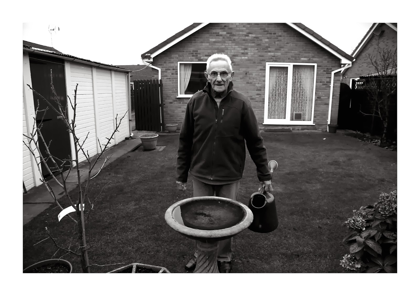
1) My brief stated that I was going to do a Documentation of a Daily Routine of an Elderly Person and a Younger Person. But since going out and actually shooting, I only followed my brief by 50%. As I decided I was only going to shoot of my grandad, despite the fact I only followed 50% of what my brief said, I still had a successful outcome with my images. I also still followed my brief in terms of the artists which i was inspired by, as I still produced images in style of Julian Germain and Kaylynn Deveney. Even though I was inspired by these two artists, there work showed a lonely man, which whilst taking my images I decided this wasn't something I wanted in my images, I wanted a more warm feel to the images. In my brief I also stated i wanted my images in colour for a simple and natural feel, yet when it came to editing my successful images, I found they actually worked a lot better in black and white as it brought out all of the textures within the images. In my brief I wrote about how I will present my final images, I said i would like to present them in a sketchbook/scrapbook way, but I've decided my work seems to be a lot better than that, and would make the images look wrong. The black and white images I have produced with a white boarder which i will put into a sequence and then perhaps make a book along side is what I feel would work better. Overall, I may not have followed my brief 100% yet I feel the changes i made were for the better and improved my work.
2) When I was taking my images on the day, I was able to notice my strengths and weaknesses of the Photography. As I felt on the spot whilst taking my images I noticed that some of my images weren't focused and the lighting wasn't working. Before taking the images I set my cameras ISO, White Balance and Shutter Speed, but sometimes it was wrong and I kept changing the setting of where I took my images so I kept having to change the settings which I found a struggle. So doing a bit more work with my camera with how to change settings quickly would be an area to improve on. One of my strengths in photography and this project as a whole is that I really enjoy editing my photographs, and I feel that if I have taken a bad image I can quite easily improve them photo's with certain tools on photoshop as I am quite experienced with photoshop. Also, my images as a whole went really well, the colouring, lighting and composition of my images worked. The ones that weren't so good didn't matter as I had produced a lot of images in total.
3) Overall I am really pleased with the outcome as a whole. It has been a successful project. The artists which I based my project around really helped my ideas and with looking at their work I was able to produce work with a good standard. With the brief I produced I was able to have a good focus point for my project, even though I only followed it by 50% it still came out successfully. The images that came out I was really pleased with and was almost suprised with the outcome. The images colour, lighting and angle of the images worked so well, I was trying to achieve a documentary style and I feel that was achieved
Thursday, 12 December 2013


Wednesday, 20 November 2013
'For every minute you are angry you lose 60 seconds of happiness'
These are ways i wish to present my final piece in style of Julian Germain. His work shows a quirky and unique idea, which not many photographers chose to present their work.It shows a sketchbook and diary like look which i want to present my work, it adds a free hand and old fashioned feel to the images which makes the images work. Alongside the images of the persons daily routine i want to photographs things that make that person happy to add into the sketchbook so it really doues feel like a life documentary of someones life. The drained and vintage feel to the images gives a really unique texture in the sketchbook which i would like to achieve. the image sizes seem to be a poloroid camera size.


Monday, 18 November 2013
Brief Final Idea
After my research through 3 final ideas i have decided my most strongest idea was the Documentation of a Daily Routine of an Elderly person and a Younger person. I feel that this is the strongest idea after researching styles i could shoot in i came across two photographers; Julian Germain and Kaylynn Deveney. Julian Germain did a book called 'for every minute you are angry you lose 60 seconds of Happiness' which focused on an elderly man, Charles Snelling. All of the images are said to be taken over 8 years. The images show a lonely man, and the deteriation of him over the years, as he lives alone, the images give a very sad emotion when you view them. Kaylynn Deveny did a series of images called 'The day to day life of Albert Hastings which is shows simple styled images yet the subject is so strong which makes the images, it has a documentary diary style about the images which is because of the captions underneath the images on what looks like lined paper, as if the images have been stuck in a book, and the captions are wrote in pen which shows a relaxed style to her images. So after my research this is now my final idea of what i plan to do, I will photograph a teenager and an elderly man. with all the images i produce i will make small little diaries for each series of photoshoots. Some images i may put in black and white yet i feel it will be more simple and natural if i keep them in colour with only slight editing.For these images i will be shooting from the persons home to get that real life documentary feel. I am going to present my work in a diary style way in a book.
Thursday, 14 November 2013
Concepts
1st Initial Idea - Life In Pictures Documentary
One of my first ideas for this project was quite a personal topic of a Life In Pictures, which i would be focusing on my own home life and documenting it, such as family events and the relationships in my family and also relationships outside of my home life. Focusing on the strong friendships which are in mine and others family and also my own friendships with people. I would document all of this and general routines at home . After looking at different artists who document their own home life as they are close to their families such as Juliette Mills who has photographed her families weddings, funerals and just social events of them together, i have seen that they like to work in black and white as it works well to get the textures an black and white also brings out the emotions from the images, especially the ones from a funeral. If i chose this as my main topic the style would be to make quite simple yet strong images in black and white.
 2nd Initial Idea - Documenting The Daily Routine of an Elderly person and a Younger person
My second and I feel most strongest idea has been inspired by two photographers Julian Germain and Kaylynn Deveney. Julian Germain did a book called 'For every minute you are angry you lose 60 seconds of Happiness' which focused on an elderly man called Charles Snelling, all the images were taking over 8 years, as he lives alone at his home. Kaylynn Deveney did a series of images called 'The Day To Day Life of Albert Hastings' which is just simple yet strong images of an elderly man and his daily routines. Which have handwritting underneath the images as a caption, which has a documentary and diary feel about it, it seems very natural which i feel i could do very well, by making them simple images and probably having a style of putting them in Black and white would work well with the older nature of the images.

3rd Initial Idea- Focusing on Architecture and Building work in the city of York, the difference between modern and antique buildings and the contrasts. For the old buildings in york such as the minster and other buildings as i am aiming for a documentary style project i want to research the history of each building and write small simple yet strong captions for each building.
One of my first ideas for this project was quite a personal topic of a Life In Pictures, which i would be focusing on my own home life and documenting it, such as family events and the relationships in my family and also relationships outside of my home life. Focusing on the strong friendships which are in mine and others family and also my own friendships with people. I would document all of this and general routines at home . After looking at different artists who document their own home life as they are close to their families such as Juliette Mills who has photographed her families weddings, funerals and just social events of them together, i have seen that they like to work in black and white as it works well to get the textures an black and white also brings out the emotions from the images, especially the ones from a funeral. If i chose this as my main topic the style would be to make quite simple yet strong images in black and white.

My second and I feel most strongest idea has been inspired by two photographers Julian Germain and Kaylynn Deveney. Julian Germain did a book called 'For every minute you are angry you lose 60 seconds of Happiness' which focused on an elderly man called Charles Snelling, all the images were taking over 8 years, as he lives alone at his home. Kaylynn Deveney did a series of images called 'The Day To Day Life of Albert Hastings' which is just simple yet strong images of an elderly man and his daily routines. Which have handwritting underneath the images as a caption, which has a documentary and diary feel about it, it seems very natural which i feel i could do very well, by making them simple images and probably having a style of putting them in Black and white would work well with the older nature of the images.

3rd Initial Idea- Focusing on Architecture and Building work in the city of York, the difference between modern and antique buildings and the contrasts. For the old buildings in york such as the minster and other buildings as i am aiming for a documentary style project i want to research the history of each building and write small simple yet strong captions for each building.
Thursday, 7 November 2013


Thursday, 24 October 2013
Dianne Arbus


'Boy with a toy grenade at central park' - 1962
Diane Arbus was an American Photographer who's work was based around people with different looks and had a surreal look about them, apart from children who may look odd and young twins she looked at people with disabilities such as dwarfs and down syndromes. Other people she looks at are transgenders and members of the circus. Diane Arbus said that photography should be 'A little cold, a little harsh' which the people she did take photographs of no other photographers did, and she believe what is wrong with it?
She liked to look at the flaws in people, why they look different.
The photo above shown is called 'Boy with toy grenade at central park' which is a famous photograph. By looking at the image by itself he looks like a seriously disturbed young boy, with his tiny figure, the way he clenches his hands in a claw like way, the strap of his braces handing off his shoulder and the facial expression. On first viewing you think he is seriously disturbed. Why would he be playing with a toy grenade, the image just looks odd overall. There is a juxtaposition between strength and weakness as he looks so young and fragile yet he holds a grenade which if was real he would hold so much power. When you look at the contact sheet after seeing the image, the thought of this boy being disturbed changes, as he actually looks like a normal child playing in a park as he is running around smiling and posing for the camera. Which changes the mode of the photograph completely.

'Identical Twins' 1967
This image echoes from Stanley Kubrick's 'The shining' where the twins are shown side by side in the corridor. It may not be intentional but because they are twins stood side by side wearing the same clothing it gives a mirror symmetry effect. When i first looked at the image what i noticed the most is how the twin on the right is smiling yet the other twin slightly frowns and looks unhappy. Because of the old texture to the photograph it has a ghostly feel to it, which is what is echoed in 'The shining' as they are acting as ghosts in the corridor. Identical twins, is a surreal thing, that two people can look exactly the same. Which is exactly what Diane Arbus liked to photograph.

The Twins from The Shining
Monday, 21 October 2013
Robert Frank
Robert Frank is originally from Switzerland, he was born into a wealthy Jewish Family, and because of what was going on during that time with being judged for being Jewish. He decided to move to America with his family, where he made a portfolio including 40 images. Due to his success in becoming a photographer he made a photography book called 'The Americans' which has been said to be one of the most famous and important piece of work since the world war. There was a series of images in this book which have become so famous due to the content and the meanings between the images. The themes he tackled in his images was the Divide between the rich and the poor, Alienation, Hardship, Racism and the Mass Consumerism. He was interested in standing outside and looking inside, which was his type of attitude.

Documentary looking into Robert Frank's 'The Americans'

Thursday, 17 October 2013
Photographs in style of Lee Friedlander


Lee Friedlander
'Im not a premeditative photographer'
The photographs i have closely analysed are called Americas Social Landscapes, Where i found a lot of the imagery used repetition with different line and shapes. His imagery uses leading lines and he likes to include himself in the photographs he takes.
One of the series of images he did was called 'America By car' where he took photographs every day, in rental cars in 50 different states where he took the images from inside his car. Lee Friedlander includes himself in his images, as he likes being a part of his work to show he was there, he shows he is a part of the image through shadows and reflections where you can either see him actually there with the camera or even just through a shadow with part of his body shown on the ground or wall. Which a lot of the time you may look at images and think, is the photographer a part of it? and I would always think no as there is no show of them in the image, but in this case, I like the fact the photographer wants to be a part of the work they produce, to show they were there for the events.
There are themes shown through his imagery. Which include Identity, Self Conciousness, Framing, Shadow and composition control. One of the images he took was to show hidden identity, as he takes the image and you can see his shadow on the women's body but the viewers and him know that the women is not aware of the image being taken, which is a juxtaposition. All his images show lines and reflections and him trying to complete incomplete shapes.
The images above are 3 successful images me and my group took in style of Lee Friedlander, as we are showing we are apart of the images. We took the images in the picture style of Black and White, we included Reflections and Shadows. One of the images we even showed our faces which is really revealing our identity


.
Monday, 7 October 2013
Bill Brandt


The first image is called 'Ear on the beach' taken in 1957, which has become one of the most famous photographs today, The image shows a structure; foreground, middleground and background, this structure works well and shows images genuinely work well in sections of three. With this structure of 3 in this image it makes lines in the image, which are clearly defined as the image is split. It makes the viewer view the image in sections, starting with the bottom of the image as it is the main focus with the ear. This image has a surreal theme to it, by mixing human features of the body, which is the ear and the natural environment of the cliffs and the pebbles on the beach. This work is similar to a surrealist photographer Jerry Uelsmann who's theme in photography is always using the facial features on landscapes in black and white for a strange, eery surrealist feel to the photographs. The main focus of this image is the ear, as the light in that area is a lot more highlighted and has a more defined contrast around the ear. Also the title of the photograph shows the focus and subject of the image, 'Ear on the beach' which describes the photograph fully. The images picture style is black and white, this effect brings out great textures in a photo, in this case it brings out each section of the photograph by defining each piece in the photo such as the pebbles.
The second image is 'Bombed Regency Staircase' taken in 1942 which is in relation to the war. This image shows great light and shadows, which is one thing that Bill Brandts photography is about; Light and shadows. The light and shadows in this image create lines which are highlighted with contrast and the shadows on the wall, it creates a spirally and symmetrical effect, there is platform in the middle of the photo which acts as a symmetrical line in the photo, as below is very similar as above, which is due to the lighting and shadows in the image, the lines are shown as reflected. The photo is busy yet balanced out due to the platform in the middle, as the patterns and lines are the same. The lines in the image lead the viewer in to the center of the image where the platform is.
The third image shows a similar structure to the first image 'Ear on the beach' the way it is split into thirds, which is done by the amount of lines on the image. The tunnel itself is a leading line, as it goes all the way to the bottom. The angle Bill Brandt took it on is to show the line in between the middle, it shows a juxtaposition which is the contrast of to opposites, as the train tracks are completely deserted to the pathway which is filled and crowded with two people, which is what juxtaposition is, this is the opposite to balanced images. The content of the image is about the war, which i found out after researching. I feel the intention of the photographer was to show a historic event which is why it has now become a famous photograph.
Thursday, 3 October 2013
History of the Camera
The history of the camera can be traced much further back than the inroduction of photograph. Photographic cameras evolved from the camera obscura (Pinhole) and continued through many generations of photographic technology including daguerrotypes, calotypes, dry plates, film and digital cameras. Camera obscura is pinhole photography, a device which dates back into the ancient chinese and greek times. A pinhole or lens project an image of a scene outside upside down onto a viewing surface. By trapping light and using reflections.
There was - Daguerrotypes and calotypes
Dry plates
Kodak
35mm
TLRs and SLRs
Instant camera
Auto mation
Digital camera
Analog Electric Cameras
The arrival of true digial cameras happened by the late 1980s, the technology required to produce truly commercial digitals existed. The first true digital camera that recordd images as a computersized file was FUJI DS-IP of 1988.
Picture style, White balance and JPEG VS RAW
Picture styles can change he appearance of a JPEG image. There are different effects such as Standard which is normal, Contrast which brings out the textures and darker colours, Sepia which is a faded brown colour, Sauration is the intensity of the colours in the image and Black and White which may also be known as monochrome.
White Balance is the colour temperture, it is measured in Kelvin, There are numerous different options for the white balance which is found when you click the WB button. Auto White balance, Daylight, Cloudy, Shade, Tungsten, Flourescent and flash. Here is an image which shows all the options you can get, some of the effects can either give a cold feel to the image or a warmer feel. Daylight and shade tends to give a warm temperature feel to the photograph. The best way to thinking about setting the camera is to set the camera to what you see from the light.
Raw VS Jpeg
What is JPEG? - JPEG is a standard format and is useable with almost anything. JPEG is a compresssedfile, which saves space but lacks quality due to to it missing pixels. JPEG can be manipulated, but each time you save it and edit it it loses the quality as it loses pixels.
What is RAW? - Raw is a forma that can only be used by certain software as it requires a codec. Raw is a format which is oposite to JPEG, Raw is an uncompressed file and can be processed. It contains all the information recorded when the picture gets taken, and it allows for changes such as picture style and white balance to be made. Raw files can be up to 2-6 times larger than JPEG. There are advantages to shooting in Raw, such as you have great control over the exposure when shooting. Also, if the image is over of under exposed when you capture it you can restore it when it opens in photoshop.


The images above show picture styles i used on my camera. The first 3 images are just a basic black and white effect. the last image is an effect called retro photo, which gave quite a noisy look to the image.

1) Daylight

2) Shade

3) Cloudy

4) Incandescent
The images above show different white balance styles on the same subject matter.
Sunday, 29 September 2013
COMPOSITION AND FRAMING
What are some ways we can achieve a better looking image?
- We can ensure we maximise the usage of the image, make sure the background is not distracting.
- We can ensure the subject of the photo is clearly seen.
- We can place subjects to one side of the frame
There are rules and theories that help photographers produce better images.
Rule of thirds - which is a simple method which splits the frame

Lines - important role of composition
Diagonal lines - dynamic
Lines can be used to lead the viewer, this is called leading lines such as Roads, paths, fences etc. Here are some examples i found on the internet . Leading the viewers following the lines.


- We can ensure we maximise the usage of the image, make sure the background is not distracting.
- We can ensure the subject of the photo is clearly seen.
- We can place subjects to one side of the frame
There are rules and theories that help photographers produce better images.
Rule of thirds - which is a simple method which splits the frame
Lines - important role of composition
Diagonal lines - dynamic
Lines can be used to lead the viewer, this is called leading lines such as Roads, paths, fences etc. Here are some examples i found on the internet . Leading the viewers following the lines.


Balance - if we can incorporate geometric shapes into images, this can also invoke.
Another element of balance is the use of symmetrical balance - makes image powerful, strong and gives an equal balance. Using shapes to help generate interesting images (geometric shapes - triangles)
Framing can be used to help subjects more interesting. You can also have frames with in a frame.
Here are some images i took following all these theories.

This image shows the theory of Rule of Thirds. If you split the subject you would see that
the model is right on the line on the right side of the rule of thirds lines.
using the Rule of thirds gives interesting composition and makes it more interesting to look at.


These two images shows framing. I used the frame within a frame idea. as you can see with
the first image there are a few shapes within each other by using the doorways of the corridor,
it is almost similar to using the leading the viewer as you can almost look through the doorway and follow the photograph. The second photograph is also following the same idea of a frame with in the frame by using the lift being open as a frame around the model.

This image shows symmetrical balance, it isn't exactly the same but each side is busy which gives a balance. The divided lines in the middle of the photo give a symmetrical line.

The ceiling shows symmetry. As the architecture is symmetrical, i took the image on a low angle looking up to show the ceiling.
Subscribe to:
Posts (Atom)